
The network map included in the below Korean Air Lines’ 1974 international timetable is one of my favourite maps, ever.

Jug Cerovic writes about the theory of schematic mapping in his book One Metro World:
A metro system is much more than a transportation network, it is a parallel universe where space is contracted and time is inflated.
The urban surface world and the subterranean metro world operate entirely independently, one from the other, and are connected only through a limited number of stations. Only through a station can one pass from one realm to the other.
Underground, the city acquires novel dimensions. By traveling on a train that runs straight from station to station, through tunnels and without obstacles, one can cover much greater lengths in the same given time frame compared to surface travel, or can cross a set distance much faster.
As such the metro effectively functions as a space and time shortcut inside the urban fabric. As far as the traveler is concerned, from the moment he ventures underground, the physical space separating stations immediately shrinks while simultaneously the time at his disposal offers an inflated travel potential.
A metro system thus offers a city a new and parallel dimension, different but nevertheless tightly connected to the physical one by a number of fixed gates. These gates, or stations, are connected by metro services into an underground network of potential journeys and in order to navigate it one needs a map that portrays its peculiar context and mechanisms.
Jug Cerovic, One Metro World
Jug wrote the above excerpt about underground metro systems, but I feel it can also apply to the transport network of flight as well.
I think the 1974 Korean Air Lines map perfectly captures his notion of a station being a connection point between realms — in this case, between land and sky. They are the only elements of the map that provide context to what we see on the ground, and they merely hint at the idea of landforms. The portrayal of air routes as thick, straight black lines floating in white adds to this abstraction away from the surface. It’s quite different to the ‘standard’ airline maps of thin arcing lines over land.
I also love how simple it is — it could be scribbled on a napkin — despite looking elegant, pleasing and effectively communicating the information it needs to communicate.
I’ve written about the Korean Air Line map before, and I’ve also created an Air New Zealand domestic route map in its style. On and off over the past few weeks I’ve been updating that map to today’s network, as well as creating new maps for New Zealand’s smaller airlines: Barrier Air, Sunair, Air Chathams, Origin Air, Sounds Air, Golden Bay Air, and Stewart Island Air.

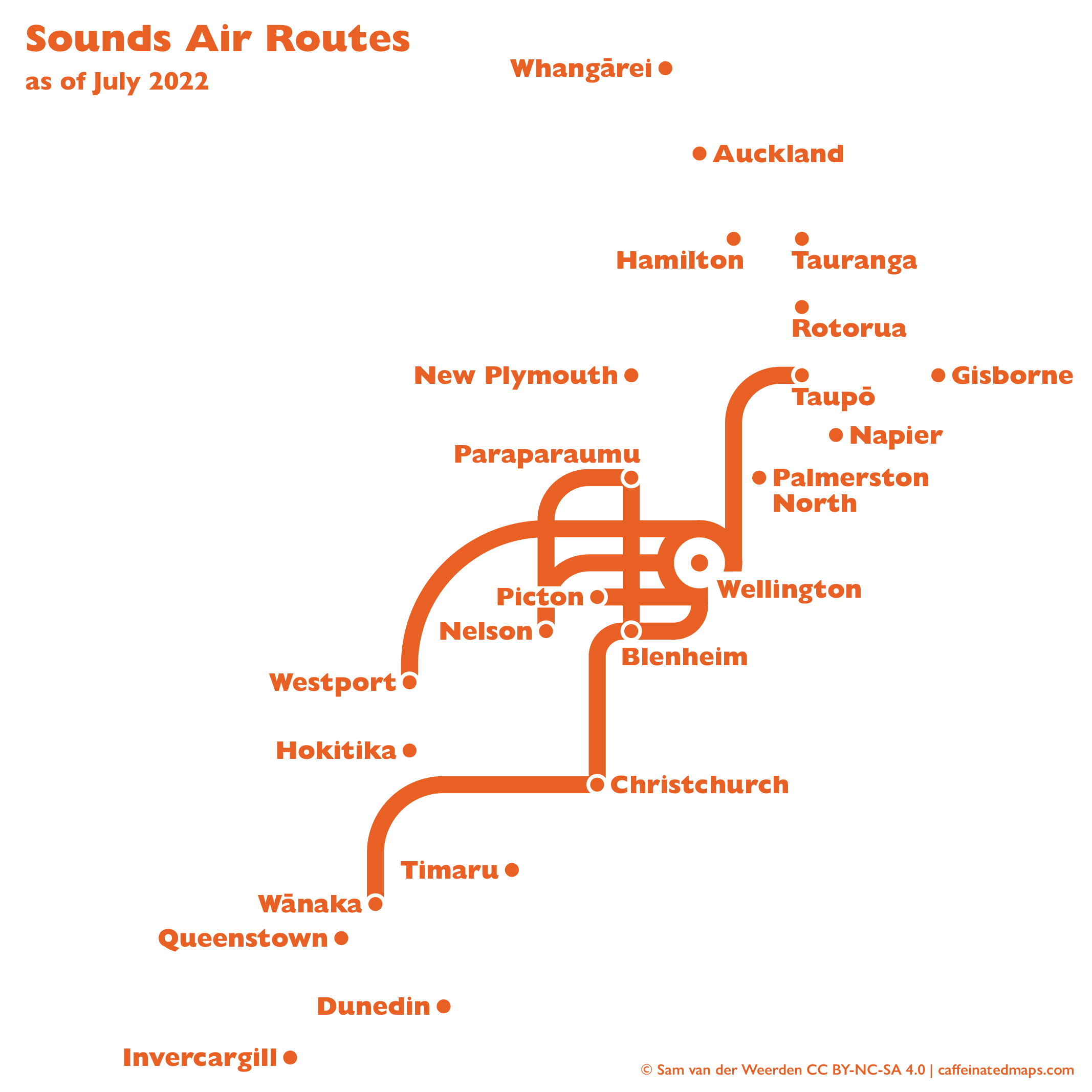


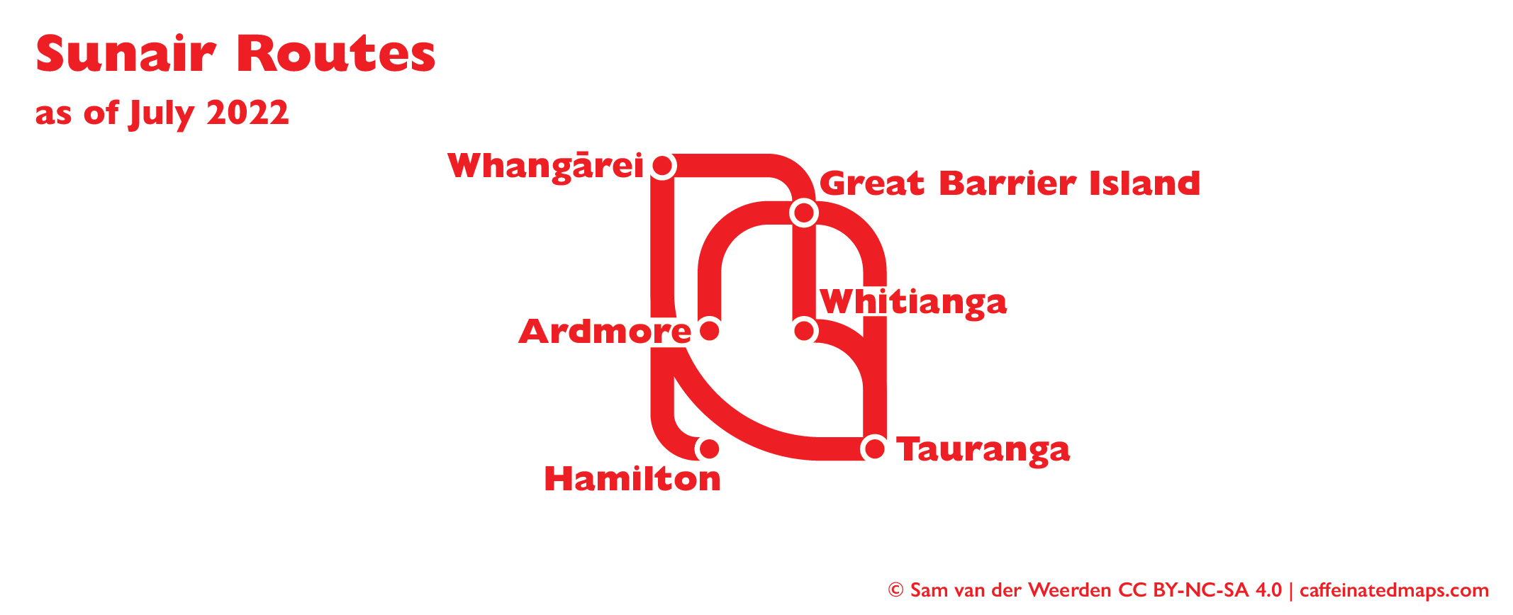


My favourites? While nothing beats the beauty (the simplicity!) (the magnificence!) of the Stewart Island Flights map, the Golden Bay Air map has a lovely shape to it, and the Sounds Air map captures the original Korean Air Lines style really well.
The Air New Zealand network is, of course, the most comprehensive in New Zealand. But that leads to a confusing mess of grey turboprop services filling in all the blanks between the solid black jet routes. I experimented with a design that breaks out the turboprop lines into their three hubs: Auckland, Wellington and Christchurch. Each service links a small airport to one of these hubs, and so can be coloured differently:

The maps for the smaller airlines were constructed to fit together too (although there’s a bit of work to do to make it work properly around Auckland/Great Barrier Island/Tauranga, and I haven’t bothered sorting white masks behind some of the text).

This project ticks off number 5 in my longlist. Up next: probably trying to finish the Auckland Tube Map (but no promises, getting the light rail alignment in the city centre is a massive pain).
© 2022 Sam van der Weerden CC BY-NC-SA 4.0
