Dunedin’s city centre is flat, nestled between Otago Harbour to the east and a crescent of hills to the west (the “hill suburbs”). The flatness remains down to South Dunedin (suburbs there are reclaimed sand dunes), while northward the land divides into hills (Pine Hill, Ōpoho) and valleys (North East Valley, Leith Valley).
The walk into town from nearby suburbs is always flat or downhill. And once you’re there, Dunedin’s city centre is remarkably walkable.
The Map
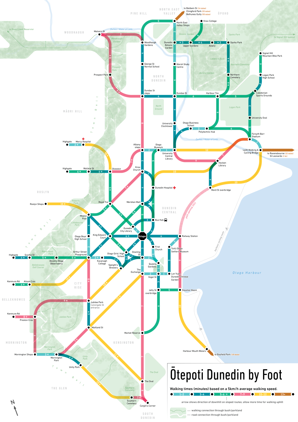
Dunedin City Council (DCC) reached out to me in 2020 (I’ve taken a good while to write this post!) asking for a map that shows off this walkability. They wanted to encourage two behaviour changes:
- Increase the number of people commuting by foot into the city from nearby suburbs, and
- Reduce the number of people driving small distances within the city centre.
Additionally, they sought a product that would encourage exploration for people new to the city (e.g., new students at the University of Otago; cruise ship visitors; families visiting for graduation).

Key pedestrian destinations and routes were selected, and then drawn into a schematic style. The colour relates to the time taken to walk the route (using the same assumed speed as Google Maps, to give consistency if people are cross-referencing between their phone’s directions). The colours and fonts for the map were taken from the new(ish) DCC palette.
Some other inclusions:
- Arrows to show the direction of downhill (one journey planning idea was to encourage the odd walk into town with a bus home at the end of the day)
- Framing the city centre between the town belt and Otago Harbour
- Pathways through the town belt and other bushy areas
- The harbourside bike path
The below early draft explored a topographical version, but it didn’t have enough punch when compared to the schematic map above. Drawing pedestrian routes in a schematic ‘metro-map style’ was unique, and guaranteed a lot more engagement than just another ol’ map. It also reframes how people think about journeys on foot: from being something stilted and full of twists and turns to being a direct, efficient route. (Some people have said this map is lying because of this! But when compared to the alternative of grabbing your car, navigating the city streets to another park, and then walking to your destination, walking is absolutely more efficient and direct.)


The final map was printed as an A3 brochure, added as a centrefold piece in the student magazine, and installed around the city on corflute.

Wayfinding
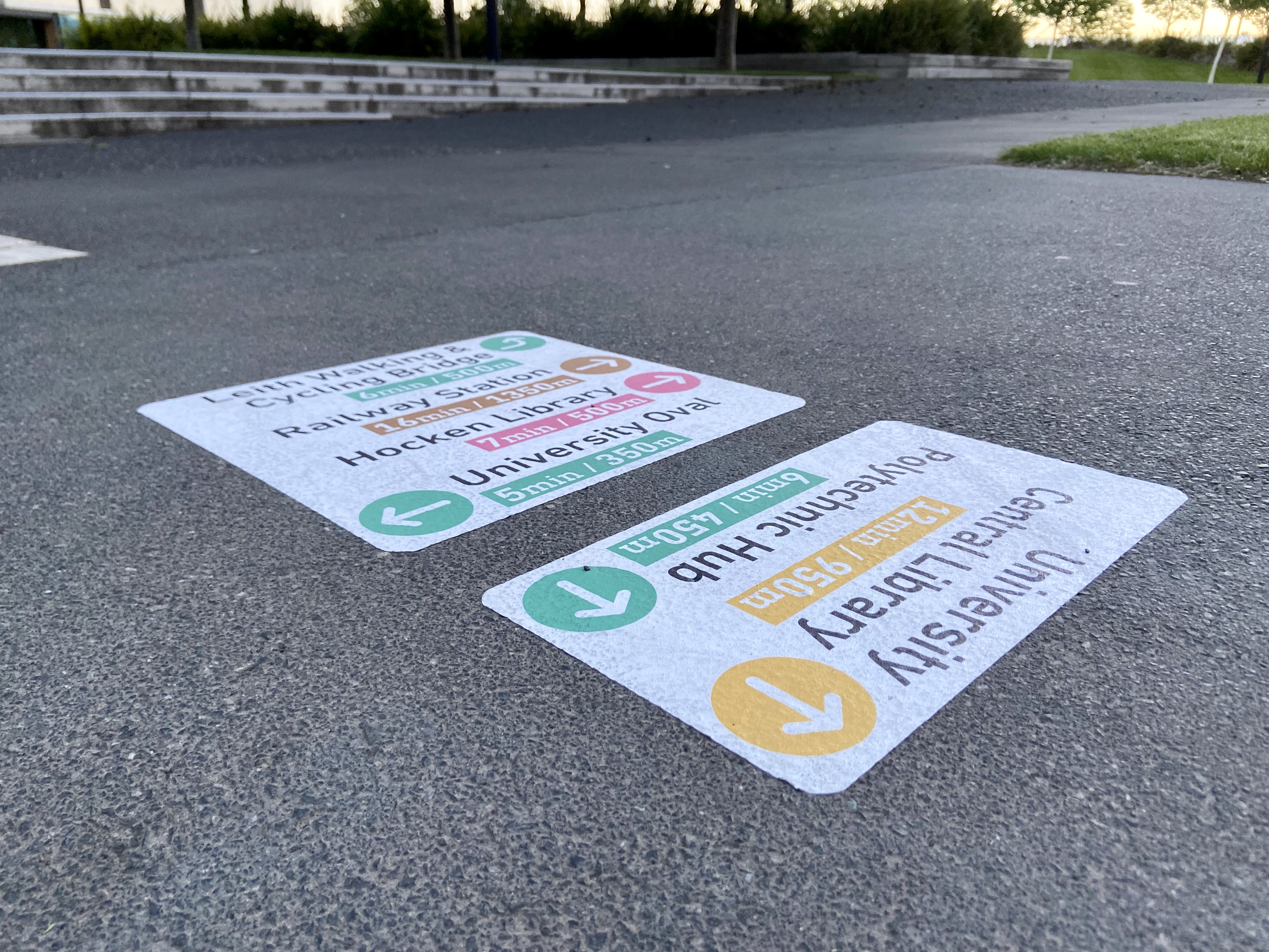
After the map went up, DCC looked into ways to support the navigation and exploration elements. While at Stantec, I developed a simple wayfinding system using the map’s design language and destination hierarchy to be installed as ground markings at key destinations in the city centre.

The intent was to have these decals in for the month of November, but they stayed around for a surprisingly long time due to the durability of the material.
I kept an eye on Facebook comments — while there was (expected) moaning about wasteful spending etc etc, there were also some really positive reactions from families visiting for graduation events in late November and early December. Providing directions to the University from the Octagon was really useful!


These two projects combined were a great opportunity to test the DCC brand design against wayfinding needs. While there are some things I’d change in retrospect, I think it performed really well — especially as a low-cost quick-win solution.
